A B2B ordering platform small grocery shop owners come back to
Enabling grocery shop owners in South-East Asia to order their core product range directly online — with clear costs, deals worth checking, and a delivery they can track
- Role
- Product Designer, ordering journey
- Duration
- 2020 · 6 months
- Platform
- Mobile, tablet & desktop — app and web
- Markets
- South-East Asia, launched in Thailand
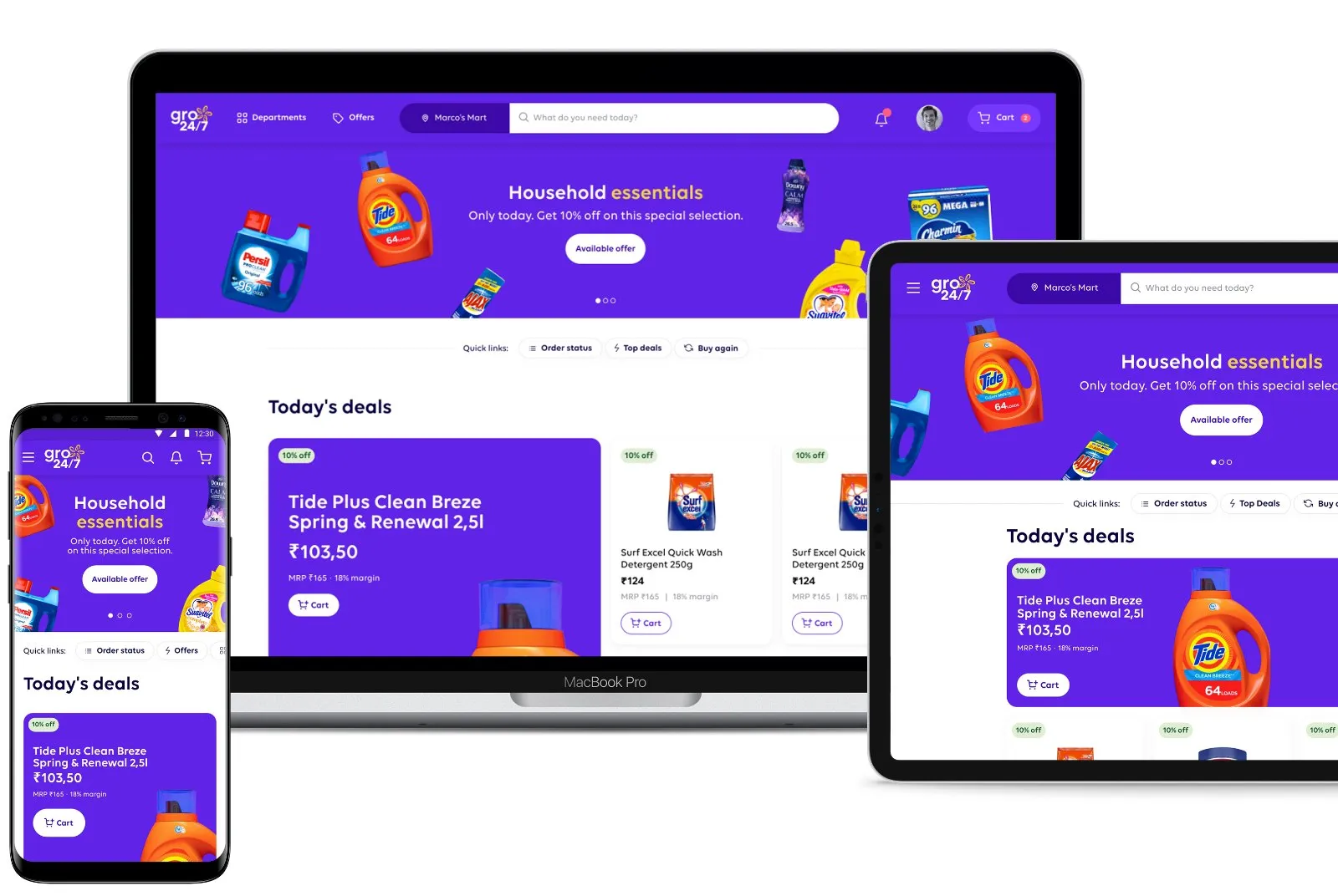
gro24/7 across mobile, tablet and desktop.
My role
Product designer in a large international team via Accenture Interactive NL
I designed the ordering journey — homepage, product page, search, cart, checkout and order tracking — for mobile, tablet and desktop, app and website:
Working within a multi-country design system and brand compliance guidelines
Designing for consistency across mobile, desktop and tablet — see the comparison further down
Communicating with multiple market experts to localise the product and loyalty elements per country
The research team ran the exploratory interviews and the look-and-feel survey; the quotes on this page are from those sessions.
Challenge
How to increase trust and engagement with the gro24/7 platform so retailers order online again and again?
Small shop owners used to place their orders indirectly, via a local sales representative. Our challenge was to make it easy for them to overview all product discounts and availability, and to build the routine of ordering their core stock through the platform instead.
What we learned in research shaped four goals — and every screen on this page serves at least one of them.
01
Trust
Show retailers every cost and every step, so nothing feels hidden.
02
Simplicity
Make ordering the core stock fast: fewer steps, one clear action per screen.
03
Support
Keep helping after the order: deals worth checking, and a delivery they can follow.
04
Customisation
Fit the platform to how each retailer works — from spelling to delivery addresses to their local market.
Every cost visible, at every step
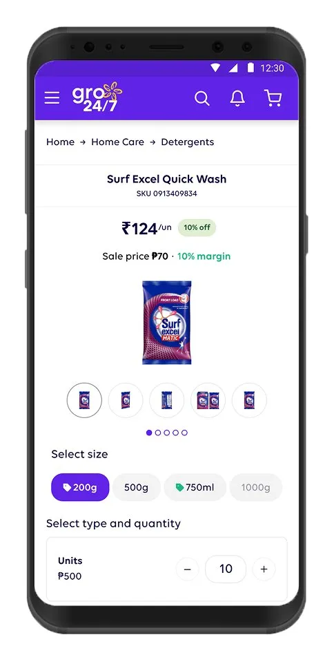
Product page
The product page allows users to switch between size, unit type and quantity, and understand promotions and costs before anything lands in the cart.
“I think it is clear, I have to choose the size, then the unit type and then the quantity that I want.”
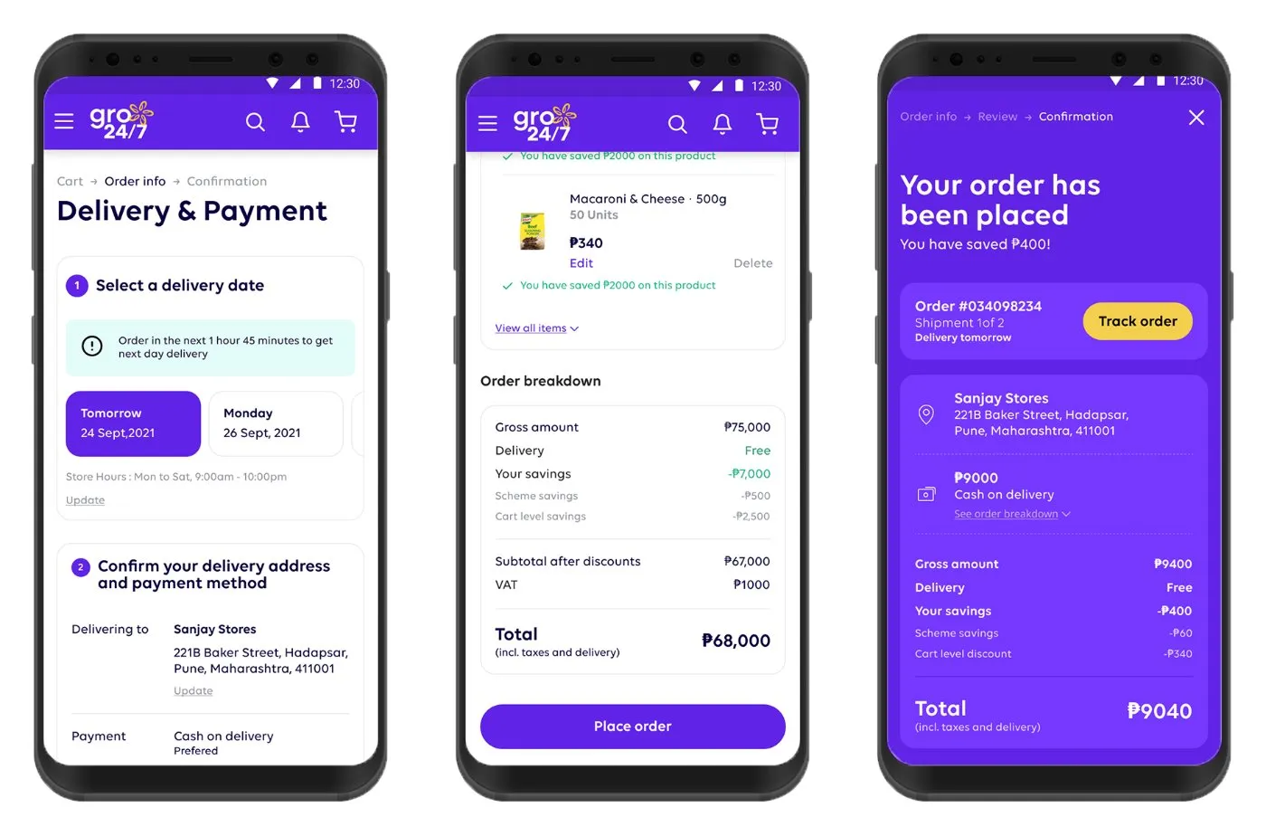
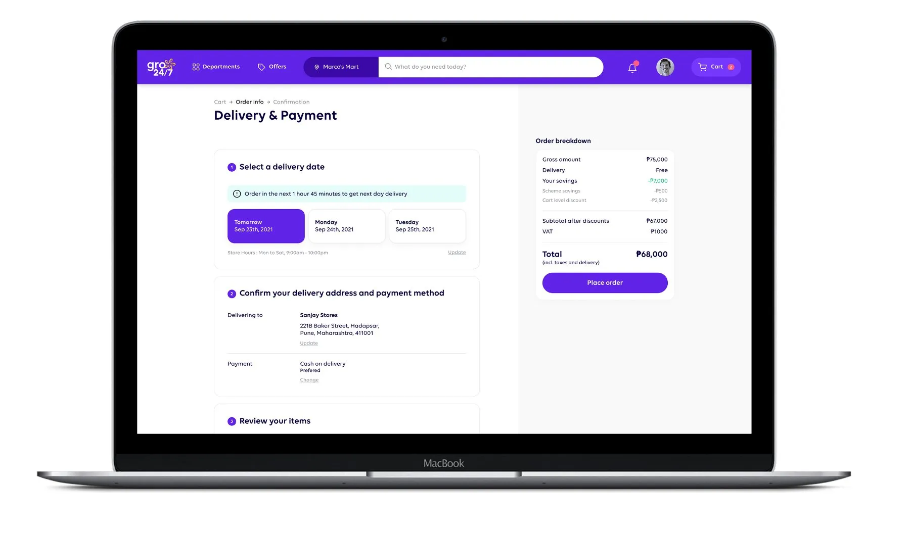
Delivery & payment
The summary of delivery information provides control and helps build trust: address, payment method and the full order breakdown on one screen before placing the order.
Fewer steps, one action per screen
Search & browse
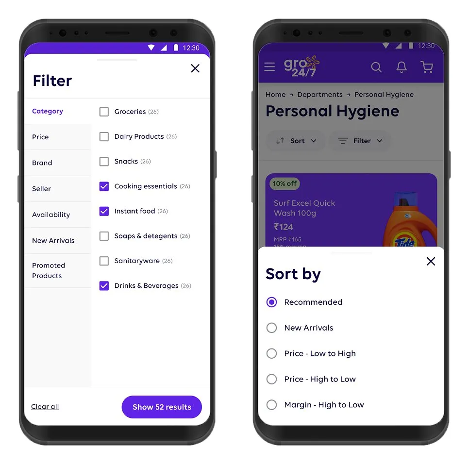
The search bar is easy to reach, but browsing via categories and filters is what retailers actually prefer — spelling out product names is a hurdle for many of them.
“It would be inconvenient to spell out product names, I rather search through the categories in the filter.”
Cart
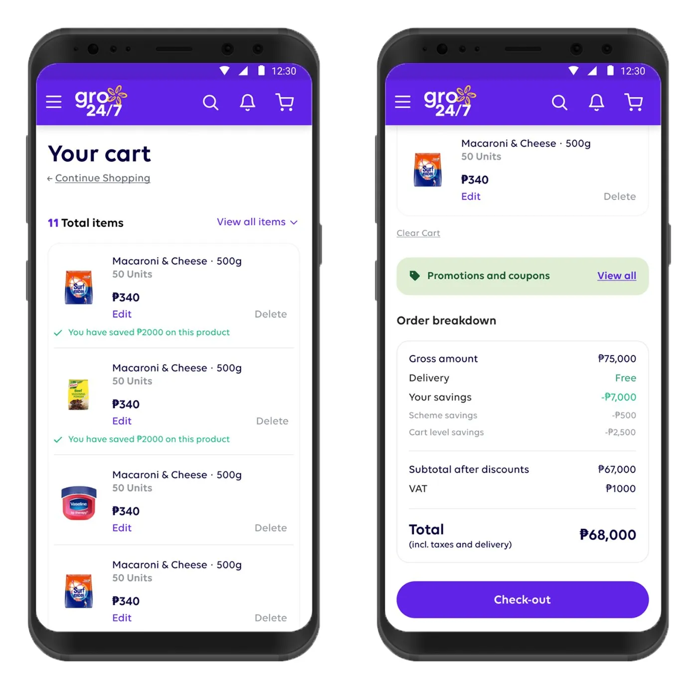
Adding a product to the cart and reviewing it is easy to do, and the info breakdown is clear. Retailers appreciate being able to review and edit the cart before continuing to checkout.
Mobile first, desktop for overview
The same journey on two screen sizes — and why they don't look the same
The flow above is shown on mobile, because that’s where most retailers order from. But gro24/7 also runs as a website on desktop, and I designed both. The difference isn’t just layout: while the website on desktop provides an overview of the items in the cart as well as the order breakdown side by side, the mobile view flows step by step with one clear action per page.
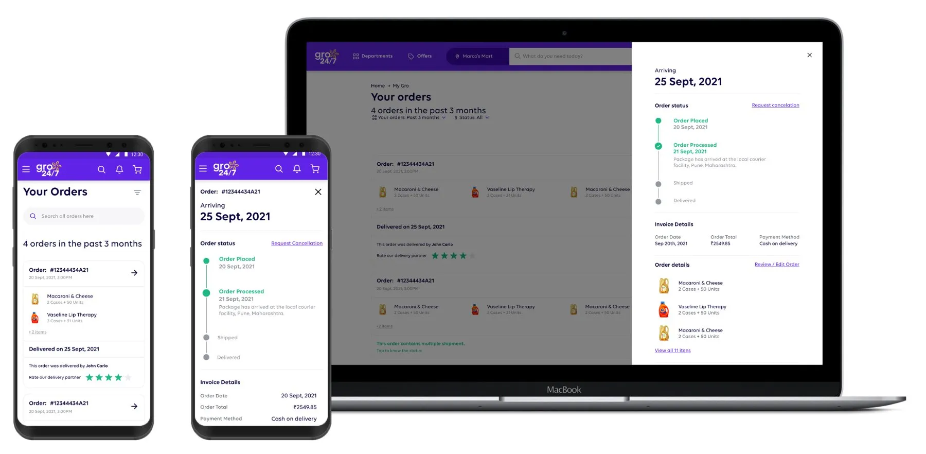
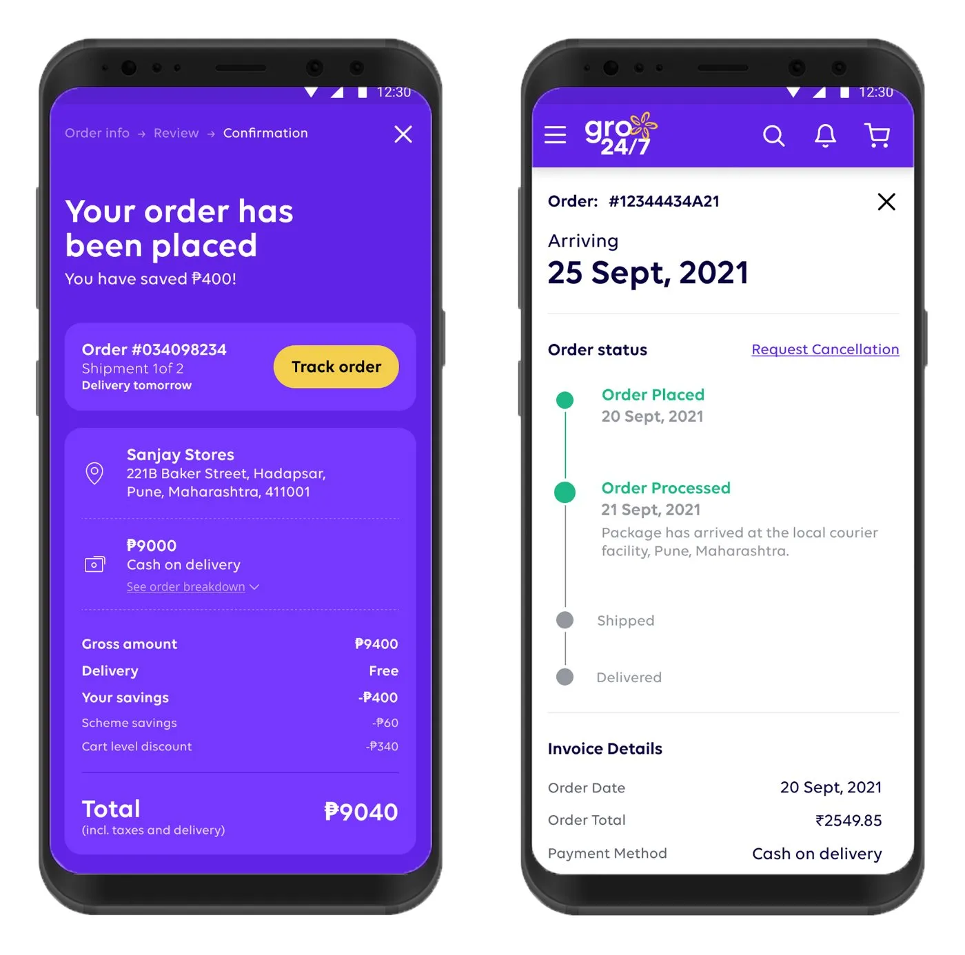
Order tracking — one side panel, two mobile screens.
Helping before and after the order
Homepage
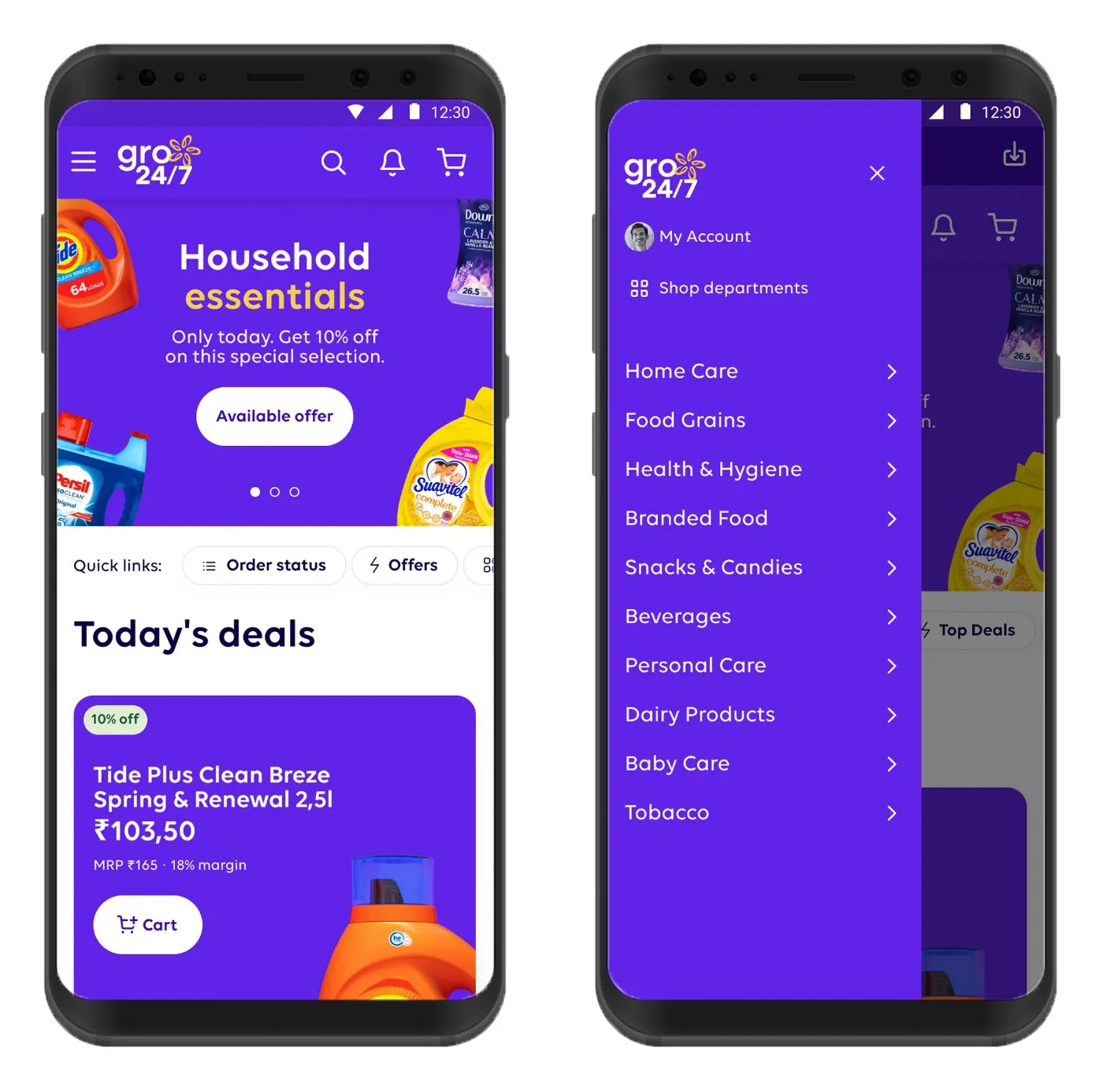
The homepage now has a clear information hierarchy, and retailers enjoy the new focus on offers & deals.
“It is always interesting to see the deal first because it is something that can benefit our shop.”
Order tracking
The order overview contains all the necessary information for retailers to track their order status — and to see early if a delivery will be late or is missing.
Fitting the platform to each retailer
Checkout
The new payment flow allows for last-minute adjustments, adding delivery comments and selecting a preferred delivery date — which matters when the owner isn't always at the store, or the address needs an explanation.
“I am not always at the store, so it's good to leave a note.”
Outcome
Released in Thailand, more markets to followValidated
Each iteration tested with retailers in exploratory interviews; the visual redesign validated in a look-and-feel survey.
Released
The gro24/7 app has been released to the Thailand market, with more markets in South-East Asia to follow.
What I can't show
I'd like to report reorder rate and active retailers here, but my engagement ended around the launch — the usage data stayed with Unilever.
Next case
Basic Fit — Remote personal coaching
Another routine problem, other side of the market: getting gym members to keep training when nobody is watching.